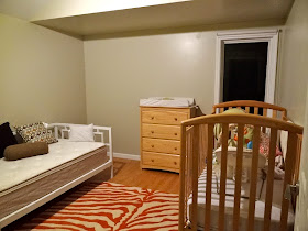
After all that hard work building the West Elm inspired daybed for the Nursery, I had a little problem. The plan originally was to place the crib on the far back wall of the room, under the alcove, with the changing table/dresser to the right as you walk in, and the daybed filling that new blank wall we had created, which is on the left wall of this photo:
But the minute the Hubs and I moved in the daybed, it was bad news. Although I had measured out the layout hundreds of times, and even mocked it up with tape on the floor, in reality the daybed and crib came up right next to each other, and made the entire room feel cluttered. Like we had just tossed in a bunch of furniture into it that didn't fit. Unfortunately I didn't take a photo for you guys, because I was a little too busy freaking out. I had just built an entire bed, and I had no idea what to do with it. I spent the first few minutes saying things to the Hubs like, "I swear I measured this...." "I'm going to make it work..." and a little overly dramatic "Stop looking at it with your judging eyes!" Eventually I kicked him out of the room and told him I would handle it. Because he is smart and values his life, he went quickly and allowed this pregnant lady to implode in private.
I was desperate, so I first tried switching the crib and the dresser. (Don't worry that I was doing this by myself, the crib is on wheels and the rest of the furniture was super light. I just took it easy moving it a little bit at a time. Trust me, everyone was better off that I was doing this myself.)
It certainly helped that back wall feel less cluttered, but I didn't love that you walk into the room right smack into the crib. So I took a little more time and flipped the beds.
Not exactly what I had in mind, but this one is going to have to work I like that since the daybed is so low profile, that even though it's the first thing right as you walk into the room, it doesn't feel to large or imposing. The arms of it are light and airy which helps, and I like getting to show off those cool rectangles I worked so hard on. It also fits perfectly below the window, and since this room only has one traditional window (with two big skylights on the ceiling), I don't want to block the view of it in any way. It still feels a bit awkward, but I think it will come together when I start to put some things up on the walls. Speaking of...
Once I settled on a location for the crib, I got started installing the old world wall decal I found on Etsy above it. I always feel like the hardest space to decorate is above a crib. It is usually the focal point in a nursey, just begging for something to be placed above it, but your decoration choices are limited based on little hands and safety issues for the little sprout. This fabric wall decal was the perfect solution for me, as it was large, but its neutral colors blend in with the room nicely.
Somehow this magic fabric is durable, yet unlike most decals can be stuck, removed and re-stuck multiple times. It made installing it a breeze, and should be easy to wipe down with a damp cloth if Baby Boomer decides to pee on it or something. (It could happen.) I just used my laser level as a guide across the top and voila!
I think it fills the room nicely and fits the look I was going for. And at just $65 for a 60" x40" wall mural, it was a complete steal.
I still have a long way to go in this room to make everything feel more cozy, but I'm making progress. (I also have a long way to go with my camera to figure out how to depict the actual color of the orange in this room (more like a muted rust) instead of what's showing (a bright pumpkin orange.) Baby steps. Quite literally actually...
PS- I was not compensated by Janette Design for talking about her awesome wall mural, I just love to share a great product when I find one.


I absolutely love the old world mural. Great purchase!
ReplyDelete