I haven't mentioned it since this Living Room furniture post, but we got a few new items for the Living Room, which is slowly making it's way from "Place where our old and hand-me-down furniture used to live" to full fledged "styled-for-the-space room".
We got our new, big ottoman in the other day. This bad boy has plenty of storage inside, which we have dubbed specifically for baby. Right now it holds diapers, spare blankets, burb cloths and a few rattles and chew toys that will be used early on. Since this Living Room is really the center of our house, with the Kitchen over looking it, I imagine that I'll spend most of my time home with baby in here, and it will be nice to have a few important items near by instead of having to run down to the Kid's Wing to change a diaper.
We also got a couple of new lamps, both in a dark metal with a matching linen shade make them coordinating, but not matchy-matchy.
In true 1 Step Forward, 2 Steps Back form though, we had a little set back. We left for Memorial Day weekend for a little R and R, and when we returned we found the art on this wall smashed on the floor. Seriously. For a quick moment I headed for the door because I thought we had been robbed, but in the end it looks like the box frame it came in (originally from Home Goods) gave way some how and the whole thing just collapsed. Now our color inspiration for the room lives pathetically leaning against the wall on the floor until such time that I can make a new frame for it. (Because of course the photo is not standard size and I can't buy one.) Apparently the Universe thinks that I have lots of extra time to build extra projects. Boo.
And the look from the other way shows that we still have a lot of work to do on these blank white walls.
Once our painting goes back up that should fill up the far right wall, and we plan to hang a flat screened TV on the left wall, with a slightly larger, but simple console table underneath it. Maybe something like this:
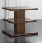
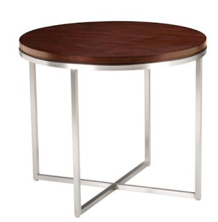
We'd also like to eventually invest in a couple of more substantial end tables which would help us visually fill up this huge space better.

This one to the left of the couch as you look at it, (first to be seen as you walk in):
And this one to the right of the couch, to help bridge the space between the couch and the left scoop back chair:
I'm thinking I can build that one in the middle, eventually. You know, in all our spare time. In the mean time I'm thrilled with how its all coming together:
 |
| Before |
 |
| After |


Nice switch to the two blue chairs. It looks great.
ReplyDelete