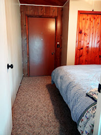
Now that the cabin has three bedrooms, and we no longer need to use home's original front door to enter the cabin thanks to our new main entry and new deck and steps, we can finally get to the business of making these bedrooms work and function for our family. Up until now we've been using the new third bedroom just for sleeping, and we'd all parade in and out though it during the day. Not ideal.
So first step of Operation Make the Bedrooms Functional, is to figure out what furniture goes where. Here's a little list of the furniture we have available to us currently:
- 1 Queen Size Bed
- 1 Double Bed
- 3 Twin Beds
- 2 Dressers
- 3 End Tables
We initially had 2 double beds, but my parents ditched one and replaced it with 2 singles. They had recently taken a trip to Europe where they noticed a trend of many hotels hosting 2 twins instead of 1 queen. They like the flexibility of this option, where people can choose to sleep separately, or push the 2 together for 1 King size. They also liked the idea of bunking these singles down the road for the kiddos. So two singles might not be everyone's jam for a couple to share, but for our family it works.
Here's how the furniture was laid out initially:
Bedroom #2 is just slightly the largest, thanks to the closet going out from the room and not being included within it. This made it the ideal space for both a double bed and a single. We can even fit a port-a-crib next to the dresser and closet, which makes it an ideal room for a family with a couple of small kids. In short, this room works.
Bedroom #3 is our new room and the smallest. We initially put the new queen size bed in this room which didn't leave a whole lot of room for much else.
Not that we need this room to be more than for sleeping, this is a cabin after all, but it would be nice to walk around a bit more freely. At this point it was our only option though, since we needed to leave a walkaway to enter into the house.
 |
| That door will soon be replaced by a window, and the whole wall will then be painted the same Aged Beige color. |
Bedroom #1 on the other hand, is pretty big, but we were challenged by the layout. I was having a really tough time planning the decor of this room with the beds placed so hap-haphazardly in front of the windows.
I tried them first against the far wall, but didn't like the unevenness under the window and tight fit of the dresser.
Placing them along the back wall left no where for the dresser to go, and it crowded the entry in a big way.
And while moving them to the closest wall made a spot for the dresser, you basically walked into the bed as you entered the room.
Since we no longer need to use the door, I was able to place a twin bed and night stand right in front of it.
 |
| I'm really anxious to add in that window, but hang with me for now. |
The other bed fits nicely against the near wall, giving the users plenty of room to navigate between the two beds and to the closet.
Bedroom #1 got a major upgrade as well, now that the big queen bed could fit nicely against the back wall.
Leaving plenty of room for the dresser on the other side.

And just in case you're curious, here's a reminder on how the layout looks in Bedroom #2


In our first home, the office was completely open yet the living areas were closed off. We changed around the spaces a bit and it worked so much better. You make excellent use of the space this way.
ReplyDelete