May 29, 2013

Installing the Wet Bar-Part 3

Let's finish up this wet bar project just in time for summer, shall we?  Last week, I left you with this:


 With the base of the bar built and ready, it was time to add a counter top.  We decided to go with a dark wood to match the built in cabinets on the other side of the room.


I picked up an oak butcher block counter top from Ikea- the same one I used for our Laundry Room remodel.  Unfortunately they no longer sell these in the cheaper and would-have-been-perfect 4 foot length, and I had to get a full 8 feet.


First step was to cut this baby to length.


I've got the wood propped up here with a couple of 2x4s underneath each side, and my saw blade adjusted to be just deep enough to go through the counter, but nothing else.

Then I had to notch out some of the edges to make it fit perfectly.  One of my favorite tricks is to use a piece of paper, and notch out your paper first to perfectly fit the corner.  Then you can just use your paper as a template to trace a cut line onto your piece. Like so:


I fastened the counter to the cabinet and support wall I made with hardware provided by Ikea.  Once the counter was on the cabinet, it was time to cut a hole for the sink.  We picked up a small bar sink from Ikea as well, and the instructions said to flip over the sink and trace it onto the counter, then to measure 1/2" in and draw your cut line.


I drilled a pilot hole with a big drill bit to get started, and then used a Jig Saw to carefully and slowly cut my opening.  Luckily this isn't an undermount sink, so it didn't have to be perfect.


Ka-pow!

I also drilled a hole for the faucet, my insulated keg line, and the beer tap drain.  Once everything was cut into the countertop, I removed it all and got my stain on.  I used the same Minwax Jacobean as we used on the built ins, and in three coats I had this:


 Next I had to test my patience and apply 7 coats of poly to protect this counter long term.  Trust me, all I wanted to do was connect all the plumbing and finish with this reno already, but you never regret spending extra time on the finish.  Has anyone else used butcher block in their home lately? Any insider tips I should know?  I'm a big fan of the affordability and beautiful looking finish, I'm just hoping it continues to look this good for the long haul.  Speaking of long haul- can we finish this project already?


May 24, 2013

It's The Weekend- Let's Build a Bar

So the first step to the wet bar was admittedly boring.  Plumbing and air ducts aren't very flashy, and if they're done well they are not seen at all, but it was a necessary first step.  Next it was time to take this empty little corner and make a bar.


So here's the plan: on the left, closest to the plumbing, we would put a small bar sink. Next to the sink base, we would put a small beverage fridge under the counter top for water, soda, chilled white wine, etc...  This fridge is not to be confused with the keg fridge which we planned to place in the Cat Closet and run a tap line out to the counter.  The keg fridge is just really big, and would take up this whole space on its own, not to mention it has been a little beat up over time and a couple moves, so placing it in the closet was the best solution. Here's a visual thanks to floorplaner.com.


My original plan was to build the sink base cabinet, but I was surprised to find this little 21" base cabinet on sale for $69.  I probably couldn't have built it for that, and it certainly saved me time.  I just had to spend 15 minutes removing the drawer and reattaching the face to make it a faux drawer so there was room for the sink.  I also took off the door for painting.


 On the far right side I had to build a panel that could finish off the edge (not just leave the fridge showing) and provide a place for the countertop to rest and be attached to. I took some left over 2x4s and ripped them down to a 3" width, which was all the space I had between my beverage fridge and the steps.  I used those to build a little framing wall to the same height as the sink cabinet.


To finish off this framing wall I cut a piece of 1x4 to create a front panel, and a 1/4" piece of plywood as the side panel.  It will make sense in a minute. Everything got 3 coats of the same charcoal gray paint we put on the wine bar, so that this whole area of the Family Room felt intentional and cohesive.


The framing was attached firmly to the back wall and side of the steps.  As you can see we didn't spare any time getting a few beverages in the fridge.


I attached the side panel before we put it in, because obviously we couldn't put it in after the fact.


 Then I just used my nail gun to attach the front panel to the exposed framing, like so:


Not too shabby, but the fun part is still to come.  The good news is we have the fridge stocked for the weekend.  Any fun plans this holiday weekend?  Is anyone planning to get in a little DIY?   I'm hoping to relax and spend some quality time with my family and friends, but I can't guarantee I won't grab a few tools over nap time.  It's a sickness friends! 


May 21, 2013

Introducing... The Wet Bar

Okay, I know what you're thinking.  "You put in a wet bar?  What is this, 1986?" And you might be right.  It seems like most modern remodels are removing the sink and bar space in their Living Rooms instead of adding one.  But let me start at the beginning, and I mean way back to the beginning.  Back to the Hub's and my wedding 7 years back.  After an amazing wedding and week long honeymoon we returned to our first house to discover a large, stainless steel keg fridge with a bow on it in our basement, a gift from our Groomsmen.  The Hubs did a party dance while I was all, "we registered for a vacuum and got a keg fridge..."  

Turned out to be one of the best gifts ever.  We were young, newly married and one of the first of our friends with a house, which meant we always got to host the parties. (You know this party planner loved that.)  We never had to create an excuse for a party, we just made the calls, "We just tapped a new keg of Summit..." The only issue was that this big stainless steel box sat in the middle of our Family Room for years.  About 5 years in we finally built a bar around it to make it fit, with a lot of help from our friend Builder Chuck.  In fact, I would say that this bar project was the first to really give me the courage to tackle building furniture.  


 And then we moved.  Of course our buddy the keg fridge came along for the ride, and some how for 2 years found himself once again in the middle of our Family Room.  So when we began this remodel we knew part of it would have to be finding an appropriate and grown up space for the keg.  (We do have 2 kids now.)  Here's the area of choice:

 
It's on the other side of the steps, right across from the Wine Bar and next to the Cat Closet.  The plan was to build in a little counter top and a small sink. Yep, I'm putting in a bar sink.  I'm a big fan of being able to quickly wash the wine and beer glasses that we use down here, rather than bring them upstairs at the end of the night, wash them, and have them sit on our counter for 4 days until someone remembers to bring them back down.  If that makes me old school, I'll take it.

The only problem was this guy:

Notice we didn't bother to paint the trim all the way to the corner, since we knew it would be hidden here.

We unfortunately have a return air duct right in the way of where our plumbing lines would need to run through.  (We can't run them through the back wall as typical, because that back wall under the stairs is made of cinderblock.)

Here's a look inside the cat closet at that return air duct.  You'll see what was just a small vent on the outside, is a big old mess for us to deal with in the inside. (If you have an eagle eye you'll also see some plumbing lines that are running through this room already, making this sink super easy to plumb.)


But I'm pretty much not scared of anything anymore, so after a few conversations with my Dad and the guys at Home Depot, I took out the tools and got us to here.


 Gross- that's a lot of dust. 

We had our buddy the plumber come out to run the water lines and return drain.  He is fantastic and did a super professional job really quickly one Saturday morning.  Then I focused on moving the return duct over one set of studs.


Of course it's all 1980's so it took a lot of trial and error to find the right parts, but eventually the guys at Home Depot and I settled on adding this contraption to the top end of the return:


 And then running this tube of flexible duct work down to the new vent.  It was pretty easy, and takes up less space than the last one.


So here is the very strange inside look at the plumbing and air duct.  A great example of the ugly stuff that has to happen in the walls before you can make everything pretty.


 Up next: my more modern take on the 1980's wet bar.  I'm really excited to show you what we can up with!  In the mean time- what do you guys think of the wet bar?  Am I the only one that appreciates their functionality?  I mean, I get how they can be a bit redundant if your Living Room is right next to your Kitchen, but for a basement or far away space I think they're kind of awesome.  Anyone else rocking a keg fridge like they're still 25?  Do you go for the more humble beer fridge out in the garage?  Does my need for a fridge who's only purpose is to hold beer showcase that we have a problem? :) 

May 16, 2013

The Final Curtain

Alright friends, we tore everything out of that big, ugly basement of ours and after months of hard work we finally put it all back together.  There's basically nothing in this room that isn't new or refinished in some way.  It's clean and beautiful, but it's also a little sterile.


That was done intentionally of course. We're big fans of minimal and neutral design at the base of the room, and then adding fun, depth and warmth through accessories.  That gives you much more flexibility to change your design style over the years without having to start from scratch.  Heck, you can even change your color pallet with the seasons if you like, switching out bright yellows and blues in the summer for more golds and greens in the winter.  I'm like the dog from Up when it comes to design- "Squirrel!" A shiny object at Home Goods can change my whole course, so it's good to have options.

First up- let's get some soft and fun curtains on that big slider.


Hubs and I had been looking for a long time for just the right fit.  Yes that's right, the Hubs was actively shopping for window treatments with me.  He may or may not have even suggested one Saturday that we all head to Ikea to check out some curtains.  Back away ladies- he's mine.

Unfortunately nothing at Ikea fit our bill for a relatively neutral gray and white color pallet, with a bold pattern.  We'd been loving a set we found at West Elm, but not loving the $50 a panel price point so much.


So we stopped into West Elm on our way home,  just to get inspiration if nothing else, and magic happened.  There were two of the Scribble Window Panels in gray, just hanging out in the clearance section with a $19 price tag on them.  The very ones we had been lusting over looking at, in exactly the quantity we needed.  Too good to be true?  Maybe.

We didn't realize (or bother to look) until we got home, but our amazing little panels were about 7" too short for our window.  They were also marked "Final Sale" since they were on clearance.  Ruh-roh. 

Fear not friends, I not only have a sewing machine, but I happened to have the perfect gray color, upholstery fabric left over from our Outdoor Section project.


Remember from back when I built a couch and then sewed cushions for it?  Sorry, I just love saying that. :)


So anyway, I just happened to have a little of this fabric left over, not a lot, but the perfect amount for this project.  Crazy right?  I cut 7" pieces to add to each panel, adding about an inch at the top and the bottom to account for seams.  I also cut, ironed and stitched 7 tabs for the back of each to run my curtain rod through.


And here's how they look finished:


Not bad- eh?  I actually like them better with the gray panel on top than not.  As purchased I think the pattern is a little busy, but the solid on top gives your eyes a place to land and feels a little more finished.  Maybe it's just me. 

How about a little before and after for fun?  Okay, but only because you made me do it.


 Everything for this project seemed to fall right in my lap, it was like it was meant to be. And FYI- that NEVER happens in DIY.  At least not for us.  It seems like there's always that huge road block you find that screws everything up.  Like the day we thought we were going to hang kitchen cabinets in our first house and instead ended up re-shingling the roof.  True story.  But this little baby is coming together nicely.  Next up- we've got a little surprise addition to the room.  I'm not going to give it away, but let's just say it's party time.

May 10, 2013

Couch Potato

Here's the thing about a remodel.  Sometime you get in the middle of it and the "okay" things you thought you were going to stick with, suddenly seem to stick out like a sore thumb among all the new stuff.  Case in point, this bad boy.  


Long time readers (Hi Mom and Dad!) might remember our love for the Ikea Ektorp 2+2 sectional.   It was one of our first major purchases as young homeowners over 8 years ago, and it has truly gone the distance with us- from crazy parties in our 20's to a puppy and poopy diapers in our 30's.  Two years ago when we moved to the new house we gave this baby a facelift with a new slip cover to retire the old Green Machine, but other than that it's held up and looks like new.


The problem was, and I knew it from the start, a corner sofa really didn't work in this space.  While we appreciated the added seating and place to put our feet up, the couch had to come out in front of the sliding glass door at the far side of the room.


 Not only did this force us to pull the couch out from the wall so we could have a little walkway back there, but it blocked the view and a lot of light.


Also, around move-in day, we found a friend for Mr. Etkorp in the form of this chair-and-a-half below.  It was on super-duper clearance at Target for just $75.  Hubs threw it on his shoulders and muscled it up to the register like a Strong Man competition. 


But it wasn't a great color match with the couch, and all that gray (plus black and white) was incredibly boring, as seen in this terrible in-progress photo below.


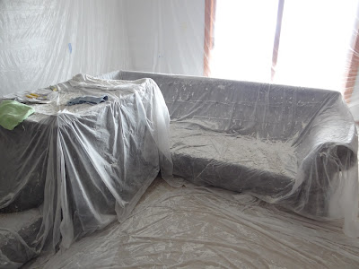
Despite all these flaws we really felt like we could channel our inner Tim Gunn and make it work, which is why they were all stacked up and tarped in the center of our room during the ceiling scraping project from hell


And then one Saturday the Hubs saw a pretty amazing deal on furniture, and convinced me to just stop in and look.  The sofa + chase combination he found looked even better in person than in the ad. It still gave us a little extra seating and place to put up our feet, but this style wouldn't block the sliding glass door. And then by some miracle we found a complimenting chair in the clearance section.  Before our boys melted down, we somehow went from "just looking" to "proud owner of a new couch and chair" for about $700.  


While 700 bones might be a great deal for 2 pieces of new furniture, it's still a really big purchase for us, so as soon as we got home I went into Craigslist mode.  I posted ads for both the sectional and chair, and barely hit send before the emails started to come in.  I must have under priced them both, because a few bidding wars ensued, and within 24 hours we sold both pieces of furniture for $625 total.  Yep- do that math with me, ultimately we got our new couch and chair for just $75.  BAM!


Don't get too excited, our celebration quickly came to a halt when we saw the furniture in the actual space.  Our awesome new charcoal gray couch was green.  Really green.


I'm not sure if it was the lighting or what, but it didn't work.  We tried.  We wanted to love it.  The Hubs vehemently proclaimed that it was in fact not green.  "It just needs some pillows...."  "Perhaps with different light bulbs..."  Finally we came to terms with our new unintentional Green Machine when a friends came over.  Hubs asked him, "Do you think it looks green?" and he responded, "What color is it supposed to be?  It's definitely green."

Lucky for us we had a 15 day return policy on the couch, and they happened to have another option that we overlooked the first time because it wasn't on sale.  But now 2 weeks later, it was- for the same price as the first couch we purchased!  It was like it was meant to be.

It's gray. :)

 Our chair works better with it too.


Not sure if we'll keep rocking that ottoman, but it works for now.  We're also considering layering another rug here, but that's TBD. And sure, we have to get stuff on the walls, and that end table in the middle is a hot mess, but for now we're just enjoying the place to sit.  It's progress.