March 31, 2014

A 15 Minute Cabinet Makeover

The Swingin' Sixties kitchen that came with our cabin up north featured some pretty Gothic cabinet hardware.


The knobs came in two pieces, the actual knob and a "decorative" piece that fit in behind them.  It didn't take me long to realize one afternoon that I could unscrew the knob, remove that eyesore of a decoration, and then simply screw the knob back on.

Already a huge improvement:


Which got me thinking... these cupboards could go a long way with a simple hardware replacement.

Cue this gorgeous pile of junk:


Boden even got in on the action, helping Grandpa lightly sand, wash, and apply a little Old English to the area before we attached the new hardware. 


And in less than 15 minutes we had this game changer:


Sure, I'd still love to build new, Shaker style cabinet doors for these cupboards eventually, but that could be a lot of cash and time.  This little update will help me look past the cabinets for awhile and focus on the bigger issues.  (That floor!  Our new front door!  The fireplace! Did I mention that gross linoleum floor?)

March 27, 2014

Backsplash Dreaming

We've been wall paper striping and painting up a storm up at the cabin, but after all that brutal work, we still have a huge eyesore going on in the center of the kitchen.  Remember when we stripped this floral wallpaper:


To reveal this:


We didn't bother to paint over this orangesicle dream because the plan is to install back splash tile above the counters on both sides of the kitchen.  The first step is to plan the look we are going for in this space.  While we refer to this place as a "cabin" and will use it as such, there's no denying that this is a 1960s rancher.  So unless I completely gut the kitchen and most of the house (which isn't in the plans or the budget), we're never going to achieve a truly rustic kitchen like some of these beauties.


The goal instead is to come up with a vibe that fits the architecture of the house, but feels warm and lived in with rustic touches.  I know I'll need to live with the dark wood cabinets (specifically my parents said I would have to wait until they die to paint them, because they are dramatic like that), but that's okay, because I think the rich, dark wood tone can look great.  Although I'd love to make new doors for them at some point, but that's an entirely different blog entry.  

I also know that we plan to install wood floors throughout the main living space, which will likely be a rustic maple or hickory to play off the various wood tones throughout the space.  These kitchen are much more modern then we are going for, but they give you a good sense on how dark wood cabinets and rustic hickory floors can live together without the "overwhelming wood" effect.


But let's get back to the subject at hand- back splashes.  Knowing that I'm working with dark wood cabinets and rustic wood flooring, I searched the internet for inspiration, and instantly fell in love with options that brightened up the space with white counters and white tile.  Like this:

See it here
And this one with the amazing farmhouse sink and vintage faucet.  I'm going to need one of those.
See it here

And this one with the Ikea farm house sink and faucet- more in my budget.
See it here
Notice what all those have in common?  Simple, white subway tile back splashes.  That narrowed the field pretty quickly.  Subway is cheap, timeless and easy to install.  We thought about a few variations, like this skinnier version: (all from the Lowes website)

Or smaller mosaic:


Or beveled edges:


Or this slightly more vintage looking pattern:


But in the end the group (The Hubs, my parents and I) agreed that the simplicity and price of subway tile is hard to beat.  Plus, we loved it in all our inspiration images.  I was really pushing for a herringbone pattern install like these:
 
See it here

See it here
But we were worried that with just the 18" space between the counter and cupboards this pattern wouldn't have time to really make an impact.  We did agree, however, that a slightly darker grout was the way to go to give this tile more interest and a vintage feel. 

So now that we have a plan, it's time to get moving.  You guys know I can't wait another minute to get this party started.  Operation Adios Orange is in effect!

March 24, 2014

Paint the Trim

We're back up at the Cabin DIY friends!  After a couple of weekends of building the wall to the new third bedroom and then priming and painting over the crazy kitchen wallpaper, all that was left was the trim.  The Hubs was gone one weekend, so I packed the boys up in the car after work to head up for the evening.  We got there just around bedtime, and once they were tucked in I got right to the business of painting trim.


See, my problem was that I had a lot of long pieces of molding to paint, and since there is 3 feet of snow and -10 degree temperatures out there, I didn't have a lot of places to paint them.  I figured tackling this project late at night when everyone else was sleeping would allow me to set up shop in the middle of the kitchen, which is basically the only long and big enough space I had available where it was warm.  So I stayed up until 2AM painting all my trim pieces and the wainscoting in the main living space with one coat of primer and 2 coats of paint.  My 22 year old self is ashamed of how lame grown-up Erin is by the way, but at least I had a glass of wine while I was doing it.

While I was at it I went out on a whim and decided to paint the bottom half of the wall in the Living Room as well, which we originally painted all one color. 


My Dad was up at the cabin too and snapped this photo before he went to bed.

Luckily that was a good, last minute, late night, drinking-wine-while-painting decision.  With the wainscoting in the kitchen painted the same, it totally brings the places together.

First Coat

First Coat

The next morning I woke up with the boys after only about 4 hours of sleep, but luckily my paint was dry.  During morning nap Ryder helped me measure and cut the trim on the miter saw I set up in the screened in porch.  (Which was -10 degrees by the way.)  I wrote a little note to remind myself which way the trim should face to cut it correctly.  I hate cutting crown molding. 


It was totally worth it though. 


I love the way the white trim makes a beautiful line between the new painted paneling and cedar wood ceiling. 


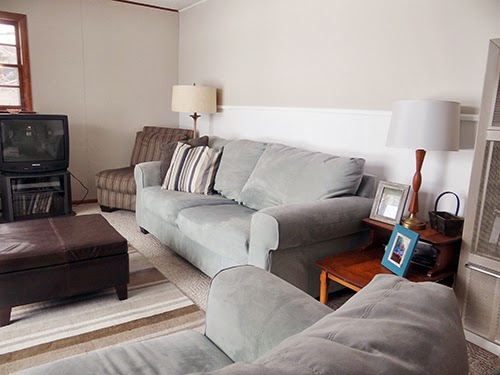
And the wainscoting and trim in the Kitchen and Living Room are totally winning.


Try to imagine this Living Room shot with a fireplace where that TV is with white, built in shelving flanking it.


See how the wainscoting ties the rooms together?  (Try really hard to ignore that gross linoleum.)


So one quick overnight trip made a huge difference in the space.  I have to admit though that it's frustrating spending so much time working on this place and still having so far to go, but I'm trying to remind myself to keep my eyes on the vision and take it one step at a time.  I remember feeling this way with our house too in the first year.  Before and afters help.  Here's where we started.

Before
After
Before

After

That's progress, right?  Baby steps. 


March 20, 2014

My Favorite Home Improvement Ever

So if I'm honest, I have to tell you that I never really intended on sharing this home update.  Mostly because I figured you all would think I'm crazy.  But ever since we completed my favorite home improvement project ever, I can't help but share it with people.  I literally have caught myself telling friends, family and co-workers all about "the best thing we ever did."  And funny enough, if they are parents, most of them agree.  

Let me introduce you to our new master bedroom doorknob. 


Is your mind blown yet?   

Or do you think I'm insane?

Let me explain.  Ever since Bath Crashers came and remodeled our Master Bathroom, our bedroom, bathroom and closet are all one, big open space.  If I am changing, showering or using the restroom, there is literally no where to hide.  Thankfully Bath Crashers installed a pocket door to our potty after we begged, but the lock has never worked, and if you have young children you know that closed doors mean absolutely nothing to them.  While I think the boys are still much to little to care, the Hubs feels strongly that if a young boy sees his mom naked at 5, it will ruin him for life.  So I've spent the last year or so trying to avoid mentally destroying my children.  Which made it virtually impossible to shower.  Have I mentioned that there is no where to hide?


Obviously I could lock our bedroom door, but the Hubs and I kept accidentally locking each other out of the space while we showered or used the bathroom, which is super frustrating when you left your phone on the nightstand and you just need to get to work.  It wasn't working for either of us.  About a week ago I finally broke.

"All I want it to be naked in my own home." -Erin

"That's all I want for you too." -Jason

And so it was on.  After a little internet research I picked up this guy for $110 at Lowes.  It was a small price to pay to regain my privacy.


The old knob got the boot.


 And I first installed the new lock mechanism.


Then the key pad slides on.


And you pull the wires through the back side of the door.

That thumbprint stain is left over from our Bath Crasher friends.  Awesome.
 Next you connect the wires and the backside of the knob on. 


Then there's nothing left but attaching the handles, putting in the batteries and setting the code.  There is also a set of keys that we hid elsewhere in our house just in case the battery ever dies, but apparently an alarm goes off before that happens, so I can't imagine that we'll ever get locked out. 


So yes, my Master Bedroom door is always locked, and only the Hubs and I know the code to get in.  There's even an auto-locking function that relocks the door automatically 30 second after you open it. It's a total game changer.  My bed stays made, the trash doesn't get pulled apart by my toddler, and I can finally be naked in my own home.  It's liberating I tell you!


Not that the boys are ever far away.  With our wall of windows open to the house I can still see and hear everything.  And I can usually spot my little monkeys right here waiting for me.


It's the best of both worlds.

March 10, 2014

More Master Bedroom Decisions

I can't thank you all enough for sounding off on the great window debate!


To be honest, from the beginning I've felt like windows into the Living Room would make the most sense based on how the house was built, but I was certain that I may be the only human in the world that felt that way.  Hearing all you (surprisingly) agree with me, was the push I needed to get over the hump.  That doesn't mean that I won't still place a window out on this wall to the backyard someday...


A few of you mentioned plantation shutters, which I agree would be a really good option, but I probably didn't describe well enough that the biggest problem with these 'holes' is the sound.  The Hubs goes to bed and wakes up really early, and the sound just echos through the house with all the open and high ceilings.  Which means I wake him up at night if I even open the dishwasher in the kitchen below, and the Hubs wakes me up just walking down the stairs in the morning.  

It. Has. To. Stop.

This amazing little option was brought to my attention though, and I'm totally smitten.


Gorgeous- right?  I can even see making these 3 holes one big one with these fold out windows like this.  I haven't gotten a price back yet, which will likely pop my little bubble, but for right now I'm lusting after these windows. Big time.

In the mean time, we're starting to come up with a plan for the fireplace situation. 


What fireplace situation you ask?  This one.


Bath Crashers put in this fireplace, and it has always felt really weird to us.  Not only is it free floating in the room,  but it is shorter than the wardrobes next to it.


It is also oddly positioned partially in front of the Hub's wardrobe, overlapping it by about 6 inches.  We're not sure why, and it just isn't working for us.  People are always like, "What's with the fireplace, was it always here?"  Yeah... uh no.


So the plan is to dismantle this little stack, keeping the cool fireplace box, and reinstall it into a full wall (floor to ceiling), that spans just halfway across the room, bringing a little more distinction between the two spaces.  Then we would wrap this fun, new, focal, fireplace wall with some sort of treatment.  Like tile:


Or wood:


Since you guys provided such great feedback on the last big choice- would please sound off on this one?  Do you like the tile, which could tie into the marble sink and make that space feel a little more cohesive? 


 Or do you prefer the wood which gives us more of the rustic vibe we're looking for in this house?  It's likely that the tile will cost much more, but we don't want to make a decision based on price alone in this forever house.  So if I could ask for this favor one more time, I can't wait to get your opinions and get moving on this weird room of ours.