April 29, 2014

Planning for the Coat Rack

For those of you just joining us (thanks for stopping by!), we've slowed down on work to our house for a little while, because my parents purchased a family cabin up North and we are working to remodel it.  The cabin had the perfect location, ah-mazing shoreline and super-sized garage, but the inside needed a little boost. 

We started with the "easy" stuff- wall paper striping and painting. It was exhausting, morale depleting work.  But we soldiered through it, and now that we're through some of the easy cosmetic stuff, it's time for the big changes.  We're taking the layout from this:

To this:


We've already built the third bedroom, and as soon as we can get a warm sunny weekend we can't wait to install the relocated front door.  I'm terrible at waiting for the weekend to tackle a project though, so I had to find something for myself to do on weekday nights while we were home.  Cue the coat rack.


We don't have room for an entry closet with the new configuration, but we do want to provide some sort of a coat rack and landing system for when we walk in to define the space.  This inspiration looked like the perfect set up to me, not too big and no blocking of the sight line when you walk in, with just enough storage to tuck shoes out of the way. 

My first step was to reconfigure the plans for my exact size, and then figure out my cut list and shopping list accordingly.  Working with math and graph paper makes me unnaturally happy.  I'm not ashamed of my nerd-dom.


Then it was time to strap the kiddos in the car for the big trip.  Thankfully Home Depot makes it just as fun for kids to go there as it is for wood shop mamas.  Balloons, popcorn, race car carts... it's my boy's jam.


Usually I can't go wood shopping with the boys or there will be no way to get it home, but we recently purchased a Dodge Durango with third row seats, and I was dying to give it a spin. With the boys stacked vertically in the seats, I had plenty of room to strap down my lumber on the other side.


Now we're talking! 


We've got some warmer spring weather and the smell of sawdust- it's going to be a great week!

April 24, 2014

Dying Curtains

In last week's post about our cabin bedroom updates, I neglected to mention the new navy blue curtains.


These curtains had a former life in our Family Room.  They looked like this:


After we replaced this:


But eventually they were given the boot when we replaced them with this:


True to form, the Hubs tried to give these curtains the boot nearly a dozen times, but my hoarder mentality managed to save them, and now I get to do the "I Told You I'd Use Them Again" dance.  

It wasn't that easy though, because these babies started out turquoise.   Nothing a little Rit Dye couldn't handle. 


I started by rinsing the curtains out in my laundry tub, and to my surprise a lot of color dye washed out. 


After I rinsed them clear, I filled up the tub with hot water, and poured in my packet of dye and 1 cup of salt.

The key to dying this big amount of fabric is to keep it moving so that the dye doesn't set unevenly in folds or creases.  It's not easy trying to stir a giant cauldron of inky dye. I started with a broom handle:


But found the tongs more effective for lifting and spreading out the fabric. 


After about 20 minutes of this, I drained the sink, then spent another 5 minutes rinsing all that fabric clear of dye.  Once the water runs clear you can throw the fabric into the washing machine for a cold cycle, and get to the business of cleaning out your sink.


I momentarily freaked out when I saw the condition of the sink, but luckily a little elbow grease and some Soft Scrub with Bleach made it better than new. 

After the wash and dry cycle. I was pretty thrilled with my new navy curtain panel.  This photo below is the best color representation of where we started (the left) and where we ended up (the right.)


It took me just over a half an hour to dye the first panel (not counting the washer and dryer time) and the next evening after bedtime I dyed the second panel.  So just over an hour of pretty tedious work, but the result is 2 curtain panels for just $3.29- the cost of the dye with coupon.  I'll take it.


April 17, 2014

Cabin Bedroom Updates

The tricky thing about this cabin reno we're working on, is staying realistic.  I could spend hours online looking at photos of gorgeous, lake front retreats.  Obviously we want our place to have a homey, lived in, heritage-filled vibe, but we also need to keep this affordable.  We always seem to come back to the reminder phrase "It's just a cabin." But at the same time when you are putting the work in, you want it to be worth all the hard work, and make it like the place you've been dreaming of.   I've been learning that the solution is to take our time, and keep our eye out for the right (read: on clearance) things.


That's why we worked like crazy to rid our cabin bedroom of wallpaper...


But we left it with boring white walls and generic bedding...


I just hadn't found the right deal yet.  Luckily, West Elm came through in a big way.


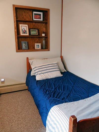
After virtually stalking this bedding set, and others, online for months, I found the duvet in the clearance section for just $39, and the shams for just $9.99.  I picked up enough shams to also tie in the twin bed in the room, bringing us from this:


To this:


For now I think we can make this navy comforter work with the addition of a couple pretty shams and a cozy throw.


I've got more work to do on that built in shelf, but at least we're off to a good start here of family photos. A cabin sunset, my brother and I as kids with my Mom, Ryder's first time fishing, my parent's first photo together as teenagers and the first jump off the dock seem like a pretty epic collection of memories.  I'm keeping my eyes out for the perfect items to round out the collection. 


While the curtains and an old black and white framed photo help fill the space now, ultimately I plan to build a new headboard to really become a focal point in the space.


Something like this amazing inspiration from Little Yellow Barn would help with the issue of adding lights, but not having room for end tables.


I'd also love to add something over the wall of the twin bed.


Maybe some homemade painted paddles like these, hung horizontally?


Projects like those are always nice because I can work on them at home in the evenings.  The other trick to the cabin reno is getting just a few days every couple of weeks to work on it.  With our home reno I could go home every night and knock out a project or two. (Which was insane, mind you, but that's just our brand of crazy.)  This one is a test in patience however- not a strong suit of mine.  So projects I can work on at home and then deliver up to the cabin fully completed are a really nice way of appeasing my overzealous Type A personality.

This beautiful (and affordable) bedding is one step in the direction of a layered, vintage, cozy vibe we're trying to embrace up at the cabin.  We want it to feel like the materials and furniture within it might have been around for generations, but are also modern and fresh looking.  With any luck, we'll have a great combination of both.


April 10, 2014

Remove the Scallop

When I showed you the fun new back splash tile earlier this week, I didn't tell you about one of my favorite changes in that room.   Removing the gross wood scallop decoration above the sink.


We adios-ed that window treatment the weekend we moved into the place, but we held onto the scallop a little longer until I could get everyone on board.  The idea is to open up that window even more, and make it a beautiful focal point in the kitchen. When it was finally time, the scallop itself came out pretty easy with a few screws on the insides of the adjacent cabinets.  The molding that ran across the cabinets and the scallop was a little more tricky though.  First step, carefully take it down.

I didn't want to have to haul my miter saw and my nail gun all the way up to the cabin for this small project, so I went old school with my Dad's old miter box.


Next I lined up the trim piece and marked the edge of the cabinet, and the angle that the cut would have to go, just to make it error proof for me.


Then I lined up the molding in the miter box with the 45 degree angle and put a little sweat equity into it with the hand saw. You know, just like the Amish.


Then I tapped in the molding using finishing nails and a nail punch.


Just like it was always meant to be that way- right?


The other side was the same process.  Luckily since the distance between the two cabinets was farther than the pieces I was trying to cut, (the new pieces going back toward the wall), I had extra molding to work with.


Yes, I have a little work to do with paint and lighting, but we're scallop-less.  And that's a good thing.


Originally when we began tiling we didn't tile the area above the window.  It wasn't until later that evening, when we were sitting at the table eating dinner, that I couldn't stop looking at the space.  "We need to tile above the window- don't we?"  As much as we were all over the tiling experience, and I mean mentally and physically (all the materials and tools were already all put away), no one could deny that the top of the window needed to be addressed.  So after dinner my Dad and I begrudgingly brought back out the mortar, saw and trowels and added the handful of additional tiles. Totally worth it.


Obviously there is still a lot to do here.  We need to paint the window trim a crisp white, paint under the bulkhead, and install a pretty pendant light.  (Not to mention replace the faux wood countertops and install a big apron front sink.) But this is what progress looks like.  One scallop down, a hundred more improvements to go.

April 7, 2014

Tile Time

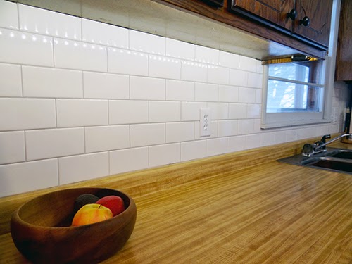
Alright.  Now we're prepped.  Now we're ready.  It's time to start tiling.  It was actually a pretty quick and fun renovation.  There wasn't a lot of space to cover, and the subway tiles were super easy to cut with my favorite tiling tool- the snap saw. Dad got started on the installing, while I did the cutting.


The other side of the Kitchen had some tricky cuts to make around all those outlets, (and I thought my Dad might kill us when the Hubs and I left mid-project to run to the hardware store before it closed,) but by the end of the day we had this.


 The next morning after a little book reading and scrambled eggs eating with the boys, it was time to grout.  We went with "Dove Gray," which was a medium toned gray.  I was worried about going really dark since point of this tile was to lighten things up in here, but I definitely wanted the definition of the darker grout to give the wall more depth.  You've seen me grout before (Kitchen Backsplash, Downstairs Bath, Main Bath), so I don't need to go over the details with you guys.  Basically you smear it in and then 10 minutes later wipe it off. 


Then I want to pet it.


The other side went pretty fast too.
 
 
While we had the wall open on this side I wired in some under cabinet LED lights on this side.  I love how they sparkle off the new tile.


The funny thing about the window on this side of the Kitchen is that we were all certain it was white, right up until the time we placed the bright white tile right next to it. 


"Oh hey there, blue-gray window."


We'll have to wait until the weather warms up to paint it so we can crack it open for a day or so.  This baby needed a refresher anyway after we pulled down the old window treatments.


When we put on the grout I thought "Perfect color!  Fist pump!"  Later after it dried I was less enamored.  It's lighter than I was planning on, but in the end I think it does just what we wanted- provides dimension without making it too dark.  Happy accident, I guess.


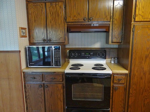
If I'm being honest I had big hopes that this tile would fix all our Kitchen problems, but now I think it just makes the cheap counter and "fancy" dark cabinets look worse. I mean, it's definitely an upgrade.  But since we've finished I can't stop myself from searching the internet for cabinet door making tutorials and white stone counter top options.  It's a sickness.


Before and afters do tend to help though. 

Before
After
It's progress anyway.  Off to Pinterest to tag some more ideas!